Excerpts from “The Icon in Magenta,” the June 13, 2014 Brash, Brazen & Brilliant column of Peter Solis Nery in Iloilo Metropolitan Times.
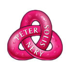
What color is the logo?
Magenta. An action color, magenta stands to mean creative, engaging, and inspirational. I know that I have a magenta aura because I am free-spirited, creative, and fun loving. I prefer an alternative lifestyle, I am clearly an artist, and I am always getting a reaction from people whether I work for it or not. I thought that my Foundation’s color should reflect those qualities and my vision. Also, I know that in-your-face magenta appears odd, eccentric, and sometimes down right scary to some people—especially if they don’t understand that bold magenta also stands for compassion, kindness, and devotion to please others. Well, I am really not worried about what other people think, only what I can accomplish. I’m clearly magenta in spirit, and so I cannot go with any other color for my logo.
What’s the shape of the logo?
Right now, the logo has two images: a nontrivial right-handed torus knot, and an outline of my face from a picture when I started the Foundation. The torus knot, also known as a trefoil knot after the three-leaf clover plant, has my three names—PETER, SOLIS, and NERY, on the bands, along with 13 stars. Thirteen, of course, in numerology means great blessings from God. Sure, it can mean destruction or revolution in the Tarot, but it is always some chaos with hope, excitement, and desperation for God’s promise to be fulfilled. Uh, and now many people are pictured in The Last Supper portrait? As a Karmic number, 13 is the number of upheaval so that new grounds can be broken. That sounds very much like the indomitable Peter Solis Nery, and his Foundation, doesn’t it? The stars, in my dream interpretation book, signify brilliancy, achievement, and lofty ideals—again, a trifecta of the Peter Solis Nery personality!
What’s the importance of the face icon?
For now, perhaps none whatsoever, but in the days to come, when I am old and weary, or perhaps dead, and people wonder about my guts to attempt and save the Hiligaynon language and literature from extinction and corruption, at least they will have a beautiful face icon to remember me by. Then, they will finally see that I am not just a beautiful soul in the inside, but rather a pleasingly handsome dude on the outside, too. Forget about what you have heard about my vanity. It is for the benefit of the future generation that I stamp my face on every good thing that I do. People always want a face to match the name, or to see abstract ideas concretized; I’m giving you the face of “inspiration,” so why are you complaining?
Do you really need two images?
Again, perhaps I don’t, but I’m paying for my logo, so what’s your problem? It’s my Foundation, it’s my money that I’m spending, it’s my logo! When the time is ripe, I can decide to drop one of the icons, or use one exclusively for a specific purpose. Have you thought of that? I am telling you, I do not do things blindly, or impulsively. When we are all dead and gone, those we leave behind will thank me for my foresight. And the logo, the icons, I can assure you, they will stand the test of time.
What do you intend to achieve with the logo?
Other than immortality? Haha! First of all, I think that the design and execution are very pretty; and I would like to be remembered for bringing into our world beautiful things. If I can popularize these icons and make people smile, or spark a play of their imagination, the logo will have achieved its purpose. But it is not lost on me that people are commercially branding everything nowadays. I want to sell Peter Solis Nery as an icon in magenta, a paragon of inspiration and daring. I know that I’m not a brand for everyone, but I want to be there for those who need me.
© Peter Solis Nery and Iloilo Metropolitan Times: June 13, 2014